


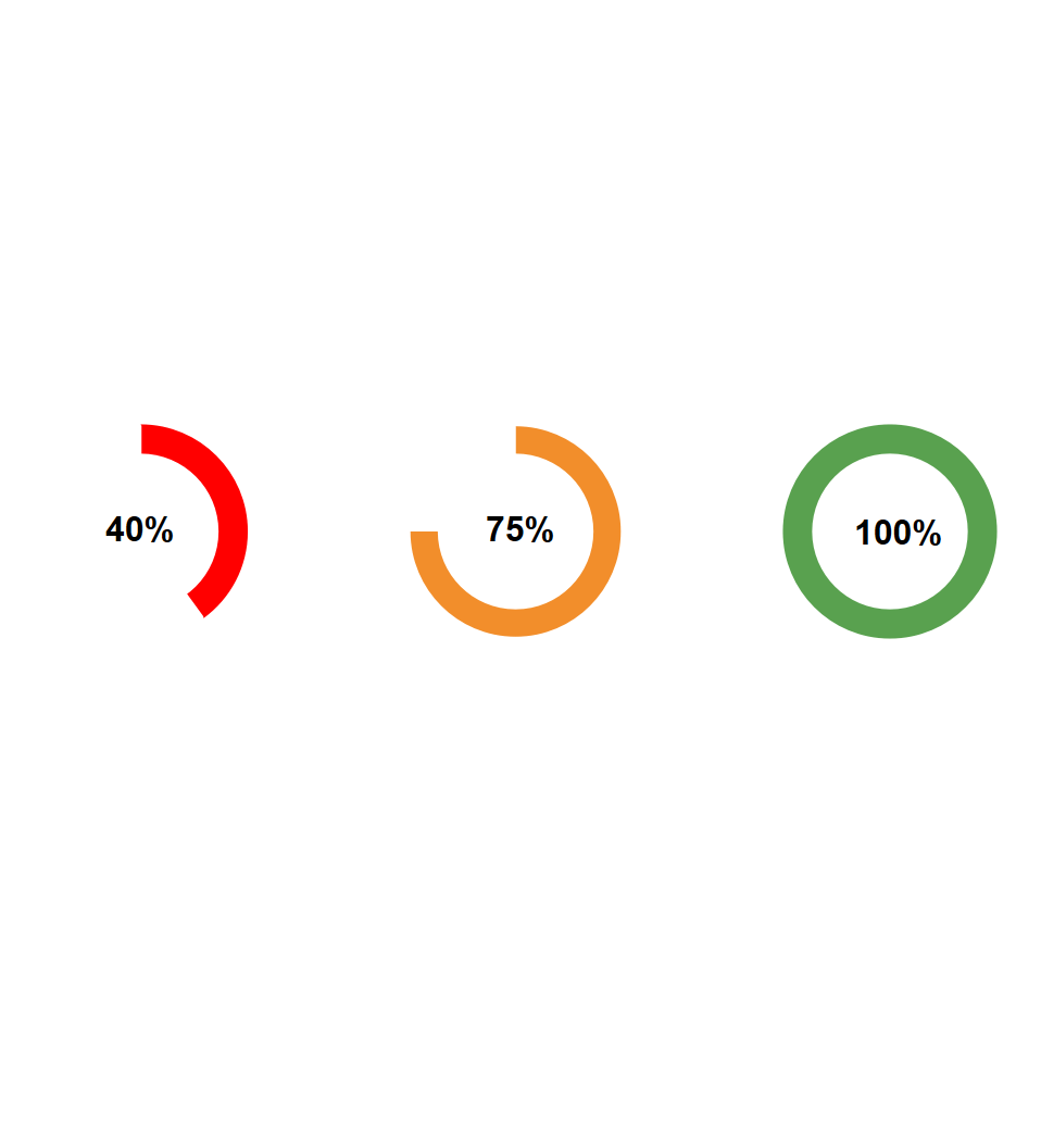
Are you trying to dynamically change the colour of the donut chart based on measure? Or trying to apply conditional formatting to a pie chart or donut in Tableau? This post is for you. I will be showing you how to change the colour of your donut chart from Green to Amber/Yellow and red when the value of a single measure in donut chart changes.

You have your measure, and you would like your donut chart to change colour when the value of the measure changes. That is:
• when value is less than 40% change to Red
• when value is between 40% and 80% change to Amber/Orange
• and when the value is greater than 80%.
STEP 1: First Create Your Colour Conditions
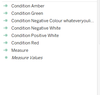
I will be creating three conditions in three calculated fields (Green, Yellow/Amber, Red)
//Condition One: Green
IF [Measure] >= 0.80 THEN [Measure] END
//Condition Two: Amber
IF [Measure] < 0.80 And [Measure] > 0.40 THEN [Measure] END
//Condition Three: Red
IF [Measure] <= 0.40 And [Measure] >= 0 THEN [Measure] END
Ensure these are Continuous Measures
STEP 2: Create the White Part of Your Pie
I will be creating one conditions in one calculated field
//Pie White:
IF [Measure] >= 0 THEN 1-[Measure] END
Ensure this is a Continuous Measure too
NOTE: This assumes that your data will not have any negative percentages (E.g.: -25%). If you do have negative percentages, you will need two additional calculated fields
//Negative white:
IF [Measure] < 0 THEN 1-[Measure] END
//Negative Colour/WhatEverYouLike:
IF [Measure] < 0 THEN [Measure] END
Ensure this is a Continuous Measure too
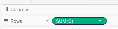
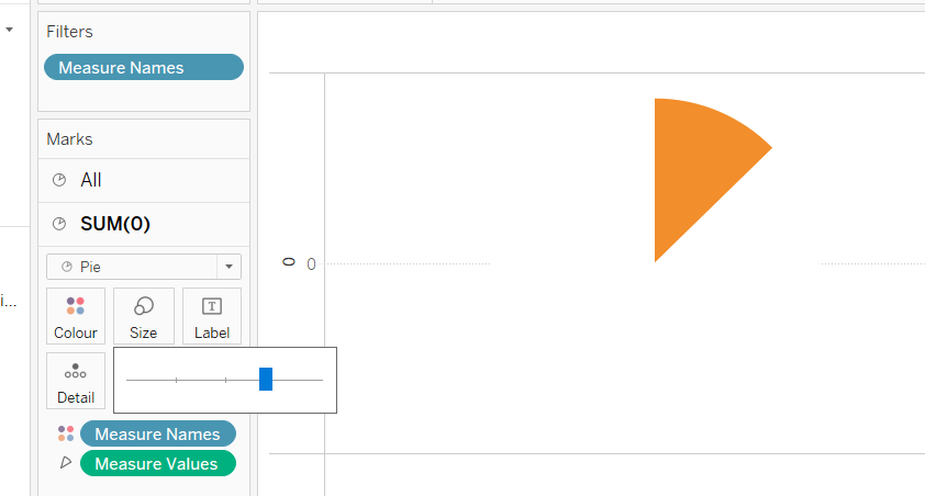
STEP 3: Bake Your Pie
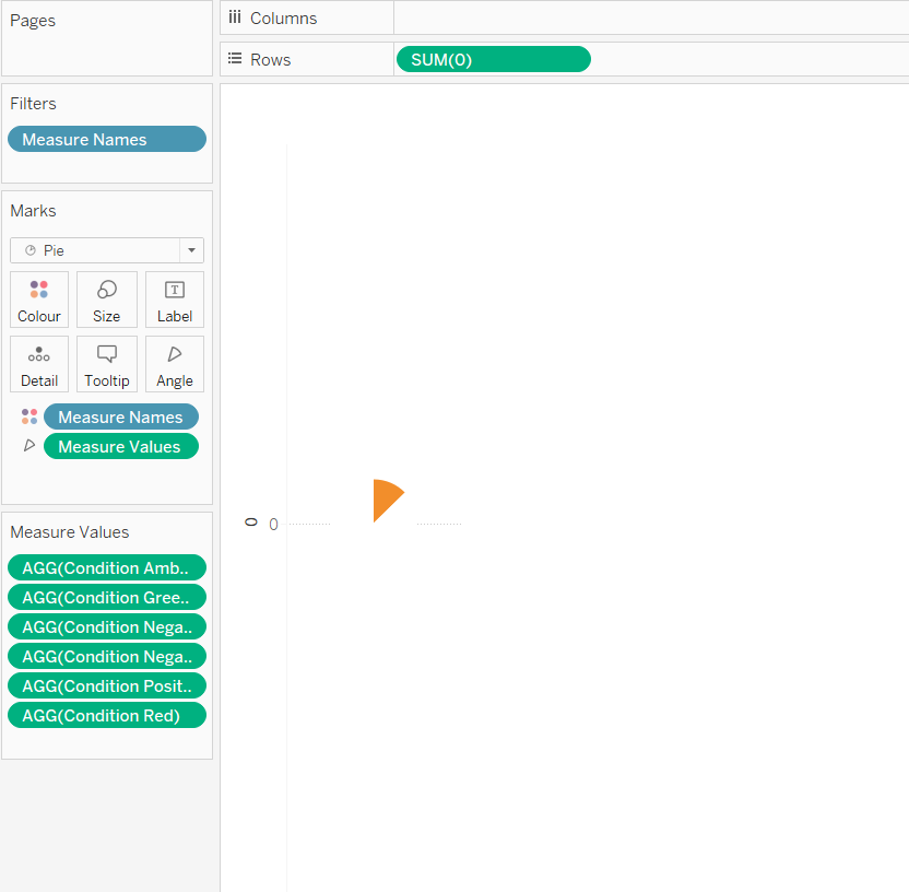
Click on the Rows Shelf and type 0 (Zero) and press Enter. This will default to SUM(0).
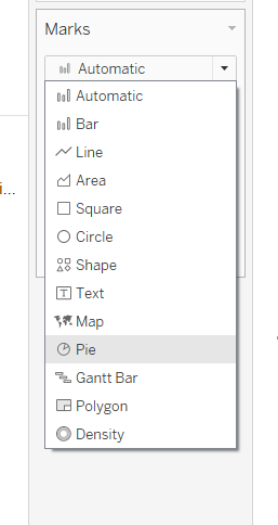
Go to the Marks Shelf and Change Automatic to Pie. This should change your line to a circle.
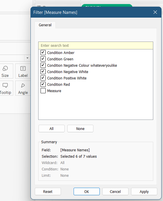
Now, drag Measure Names to the filter. If you have other measures, open the Measure Names filter, and check the filters you created to keep them. Click okay to close the dialog box.
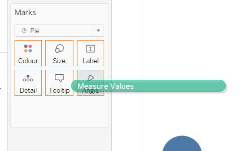
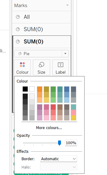
Next drag Measure Values to Angle on the Marks Card and drag Measure Names to Colour on the Marks Card.
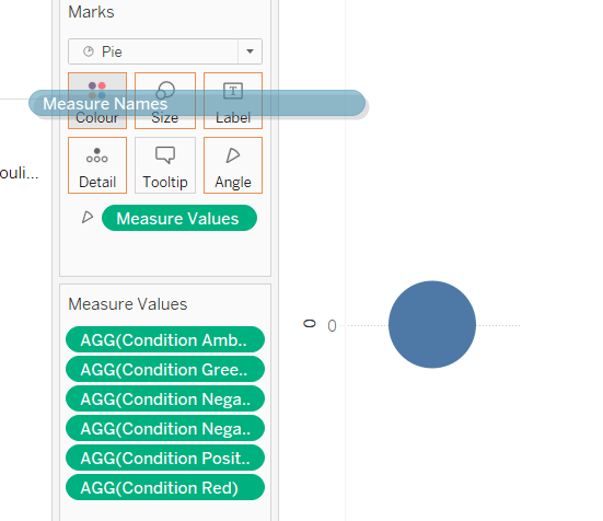
Click on Colour and assign each measure the right colour. Click Apply and Okay

At this point you should have your pie chart working.
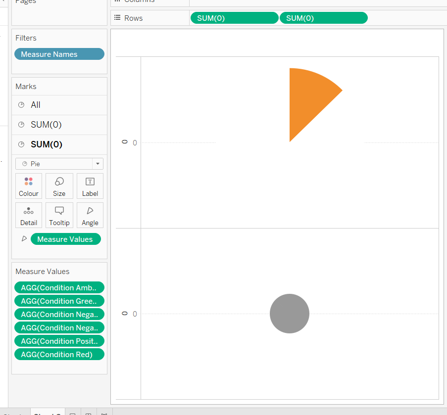
Step 4: Change Your Pie to A Donut
A Donut chart in Tableau is just one white pie on another coloured pie.To do this type 0 (Zero) in the Rows column right next to the one you created before and press Enter. This should default to SUM(0).
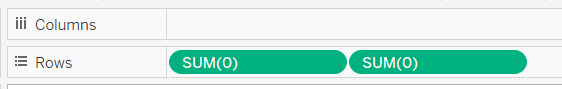
You should now have two coloured pies.
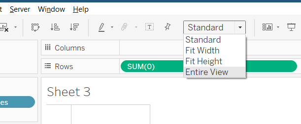
At the top of your window, change your view fit from Standard to Entire View
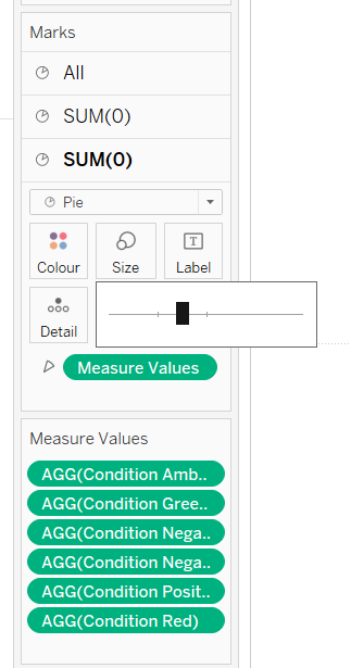
Go to the Marks card and Select SUM(0) Click and increase the Size to your preferences.
Then still on the Marks card, select the second SUM(0), click and drag Measure Names way from Colour. click and drag Measure Values way from Angle.

You should now be left with a small grey circle.
Go back up to the Rows Shelf. Right Click the second measure SUM(0) you created and select Dual Axis.
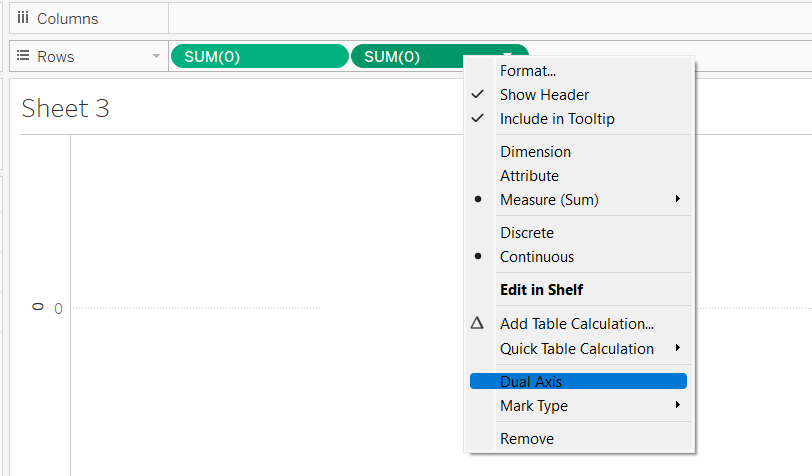
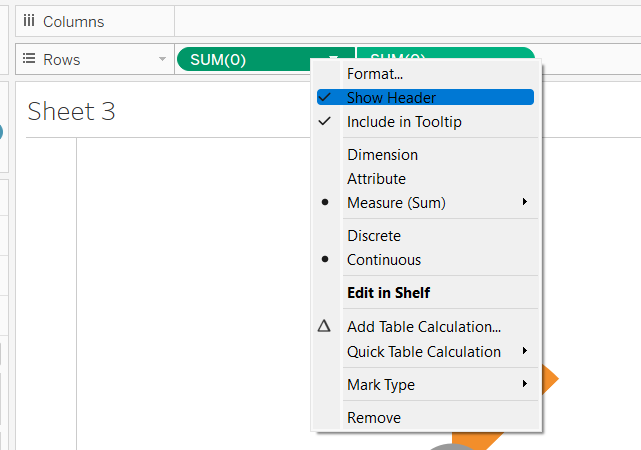
Right Click the first measure (SUM(0)) and unselect Show Header. Do same for the other (SUM(0)).
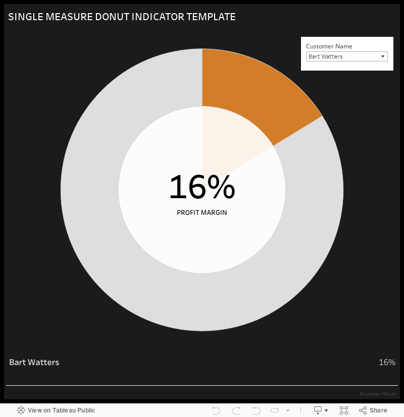
You should now have your nice Donut chart with a grey centre.

To change this grey colour, go to the Marks Card for lower SUM(0), click Colour and select White.
If you would like to increase the size of hole in your donut”, click on Size in SUM(0) and adjust it until it is as wide as you like.
STEP 5: Tidying Things Up
Now drag your dimension to the Filters card show filter, Use all. Show filter, select single dropdown, remove “All”.
Drag your measure onto the Text in the second SUM(0) on the Marks Card. Open and edit as preferred. Alignment is Middle Centre. Right Click on the worksheet and select Format. Choose Lines, select Row, Change all lines to None. Choose Lines, select Columns, Change all lines to None
There you have your conditional formatting on Donut Chart for a single measure in Tableau.
If you were unable to follow through, you can download a template from Tableau Public.
***
Liked this post?
Do share it on your social media wall, timeline or feed
Want blog updates and promotions in your inbox
